
by Maheswaran Sathiamoorthy
[box]Ever wanted to enjoy the thrill of seeing a photograph you clicked like a frame from a movie? It’s not an uphill task, really. It takes only a bit of photo processing to do it as Maheswaran Sathiamoorthy explains through a simple tutorial and some of his processed photographs. Read on. [/box]Have you ever wondered why Hollywood movies look so different from the handheld videos you shot, even if you had used, say a DSLR? Some of the obvious differences include the use of really expensive cameras and a variety of tripods, stabilizers and other equipment to minimize shaking. But in this tutorial I will try to bring out some of the other differences, especially those you can control, and will also give a general workflow to convert a normal looking image into a cinematic one.
The first step would involve opening the image in an image editor such as Photoshop or Lightroom (I will use Photoshop in this example; Lightroom can be used for the most part, and if you don’t have any of these, you could play with the editor you know). I would mostly recommend using a RAW image from any DSLR as it gives us complete control over the image. Also, certain types of images work well, like the one below which happens to be a nice landscape image. Portraits may not work well unless they have great bokeh.

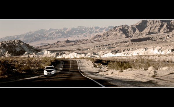
Now open any movie (not in Photoshop), and pause it for a moment. One obvious thing to note is that movies are widescreen whereas the images coming out of the DSLR are not, so you should crop it to 16:9 or even wider say 20:9, but I recommend doing the cropping at the end of the processing.
Also, if you look carefully, the colors don’t look spectacular. Yes, that’s right, they look desaturated. So decrease the saturation a little bit. In order to do this, go to Hue/Saturation in the Adjustments panel and drag the saturation slider towards the left. If you go all the way, you can see that the image becomes black and white. Experiment with it and find out a sweet spot in between so that the image is now dull-colored. You can also increase the blacks a little bit by going to Levels and dragging the left slider below the histogram a little bit towards the right. You can see that the black regions become blacker and the image is less washed out. It’s just to add more contrast to the image and this one is optional. Don’t overdo it.
Now go back to more movie watching. This time try to see Pan’s Labyrinth, or The Matrix or Amelie. If you don’t have access to these movies, just search for them in Google Images. You can see that there is some kind of a tint, generally blue, green or orange (warmth). Not all the movies have this effect but in most cases the colors are a bit off. You will have to definitely play a lot for this one. Go to color balance and you could change the balance a little bit to get a blue, green or orange hue. For example, with Midtones selected, drag the first slider to say -30, the next one to say -10 and the last one (yellow-blue) to +20. You must be mostly done by now.
The final step is where the money is, so don’t tell this to your friends. Add an extra layer at the top of the image and fill that layer with grey so that at this point you should have lost the image and must just be able to see the color you pasted. Now go to the layers panel and drag the opacity all the way down to around 10%. You must be able to see your image, but it will be washed out now. Not all movies have this effect, but if you do it, your image will be unmistakably cinematic.
This effect works quite well in images with people too. Finish the image by adding a bit of vignetting and add the black frames at the top. Note that for the landscape image, I have not added this extra layer and neither did I add the vignetting. You need to decide for yourself which effect to use for which image.
There are also a lot of other features – such as good lighting, the use of zoom lens to narrow the perspective and use of wide aperture lenses to get stunning bokehs and so on which can add to the cinematic feel.

